
Few automakers have and fewer still will ever have a history quite like Alfa Romeo’s. With a pair of World Wars, a Great Depression and other setbacks under its belt, Alfa Romeo’s logo has also endured numerous changes in its history.
Milan, where it all began
It was on June 24, 1910, in Milan, Italy, that the A.L.F.A. (Anonima Lombarda Fabbrica Automobili – “Lombard Automobile Factory, Public Company”) company was established. All new companies require a symbol that represents it. It was Romano Cattaneo, a designer, that was taken by the “Biscione Visconteo” on the Filarete Tower which he studied as he was waiting at the tram station. The “Biscione Visconteo” is the dominating Visconti family’s coat of arms from medieval Milan.
Once back at the shop, Cattaneo and Giuseppe Merosi, a top-class engineer at A.L.F.A., deliberated on the company’s logo and came up with a few versions. They ended up agreeing on one final design which consisted of the combination of the Biscione dragon, to one side, and the red cross on a white background, the city of Milan’s emblem, on the other. The final new circular logo included the words ALFA on top and Milano on the bottom, separated by two Savoy knots.
The beginning of the logo’s evolution
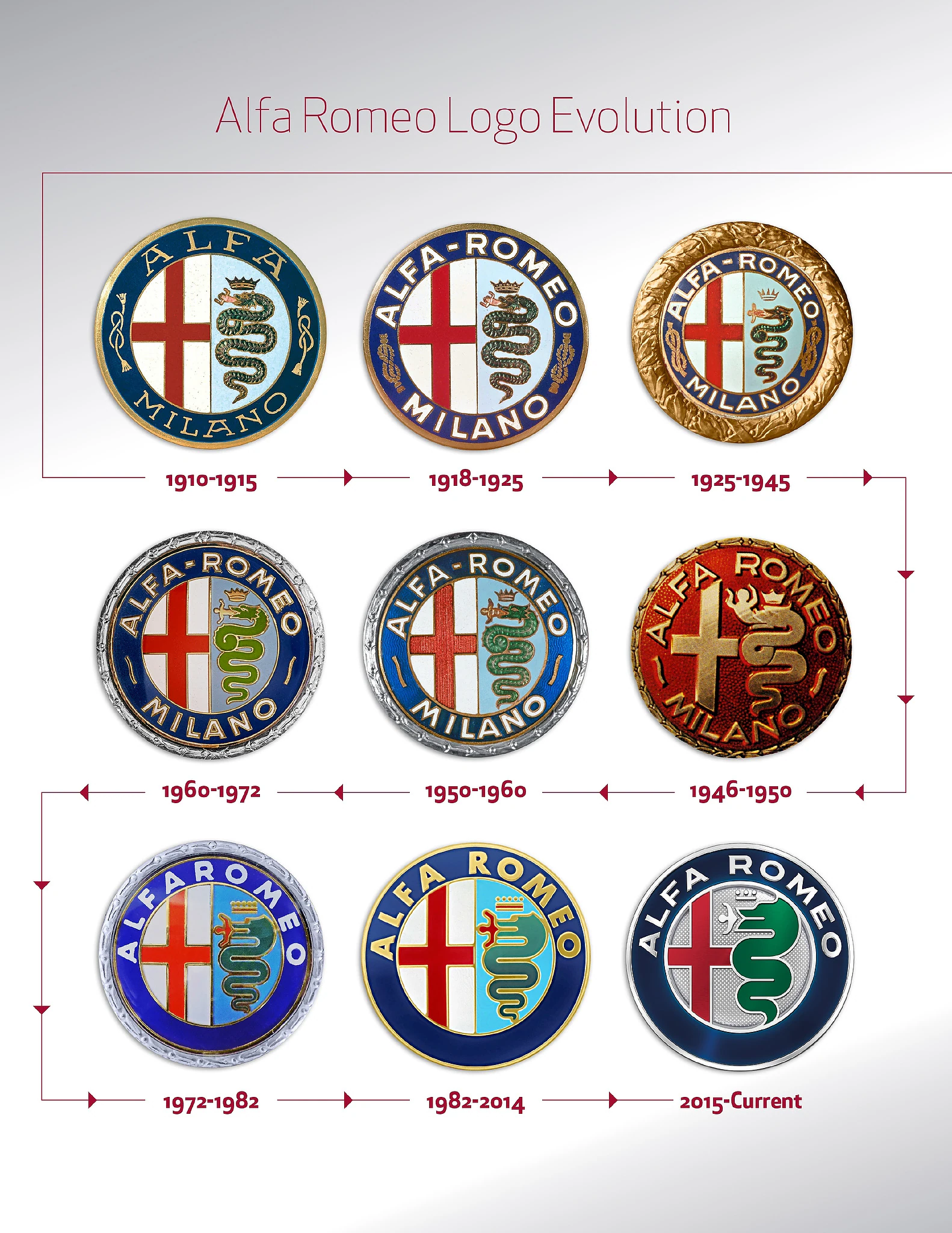
Despite certain Nicola Romeo, a young entrepreneur from Naples, arriving at the company as the person charged with handling the holding for the bank in 1915, his name was not added to the crest until 1918 because of the war.
As Alfa Romeo continued its involvement in motorsports, another famous logo came to life almost by accident. In 1923, as the racing team, which included Enzo Ferrari, prepared for the 14th edition of the Targa Florio, Alfa Romeo opted to paint a quadrifoglio (four-leaf clover) on the race cars for good luck. We know the remainder of the story as the quadrifoglio adorns all of Alfa Romeo’s high-performance vehicles to this day.
The Alfa Romeo logo once more evolved in 1925 as golden laurels were affixed to denote Alfa Romeo’s victory at the first Automobile World Championship. Of all nine iterations of the crest, the one which began in 1946 is the most striking. In fact, it’s the most divergent as the machines that produced the logo were obliterated in the Second World War and so a crude red logo was used until 1950.
In 1972, Alfa Romeo opted to remove the “Milano” from the crest as they opened the Pomigliano d’Arco Alfasud plant in the process of their expansion. In 1982, a streamlined and slightly larger made its way onto the cars.
2015 marked the introduction of the current logo. The dynamically laid out details are a proud and faithful interpretation of the original crest.